March 12, 2020
In today’s business environment, organizations rely on insightful reports to make informed decisions. However, collecting and organizing data manually can be time-consuming and often confusing. This is where reporting automation tools like EasyReports BI step in. Integrated with leading ERPs like Tally, SAP, NAV and more, EasyReports makes it easy to create customized, actionable reports in just a few clicks. Let’s explore how you can get customized reports using reporting automation tool like EasyReports.
About EasyReports BI
EasyReports BI is a reporting and MIS tool integrated with Tally.ERP9, SAP B1, NAV, D365, BUSY etc. Along with many standard reports covering all aspects of business such as Sales, Purchase, Customer, Supplier, Inventory, Cost Centre, Financial etc. We also offer extensive customization features so that you can design reports as per your requirements and specific fields used in Tally. Like dimension as Salesperson, Channel, Route, ASM etc.
Customizable Reporting for Unique Business Needs
EasyReports business intelligence tool provides scalable, flexible, and affordable reporting solutions. Users can generate monthly, quarterly, yearly, and time comparative reports based on top, bottom, ranking, and contribution analysis. The BI tool enables pivot-style reporting for quick data analysis. It also highlights Key Performance Indicators in the generated reports.
- Standard Reports which will help users to go live in days
- Report Scheduler for automated reporting and alerts
- Report Designer to help users create their own reports quickly
- Tally Scheduler to help the user (Tally) for auto-import of data
- Acts as a connector for Tally.ERP 9, SAP, B1, NAV, Excel and other databases
- Simplify users reporting needs with its dynamic dashboards
- It supports a drag-and-drop feature and allows customization based on the user’s requirements.
Types of Reports You Can Create with EasyReports
Pivot
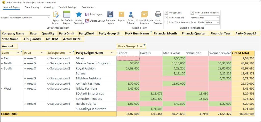
Users can use Pivot Reports for strategic and tactical reporting and data analysis in aggregates or by groups and sub-groups, utilizing different dimensions such as Salesperson, Item Category, Item Group, Project, etc., or by time intervals like Weekly, Monthly, Quarterly, etc.
Grid
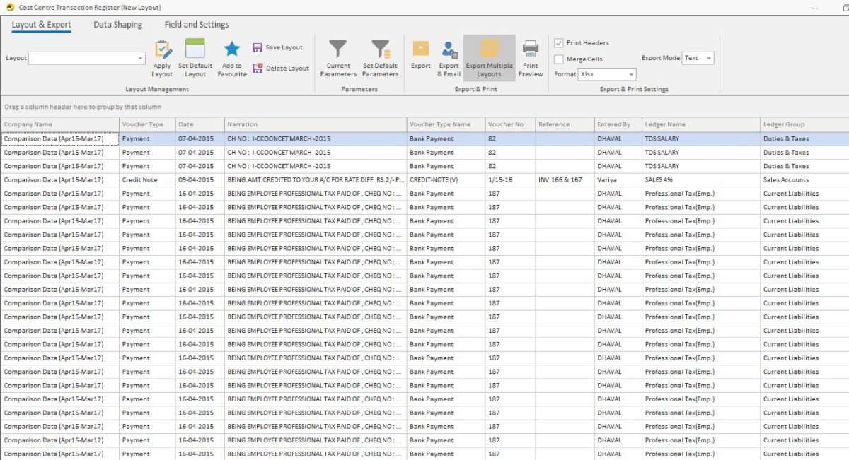
Users mainly use the Grid Report for operational reporting and analysis of individual transactions.
Dashboards
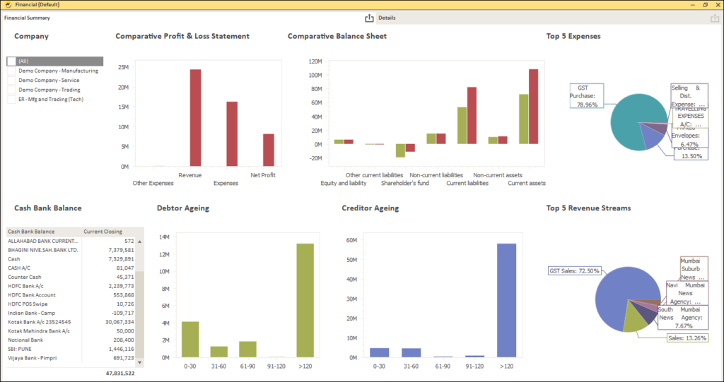
Smart Visualization with Dashboards
The dashboard is an information management tool that visually analyzes the KPIs and key data points to monitor the health of an organization, or any specific department or process or even both simultaneously. They customize to meet the growing and specific needs of a department, company, or both.
In the background, a dashboard connects to your SQL Server, Excel Files and other Databases, but on the surface displays all this data in the form of tables, line charts, bar charts and gauges.
A data dashboard is one of the most efficient ways to track multiple data sources. As it provides a central location for organizations and their respective businesses to monitor and analyze daily, weekly, monthly, quarterly or even yearly performance. Real-time monitoring reduces the hours of analyzing and a long line of communication that previously challenged the businesses.
This is how you can get customized reports using reporting automation tool like EasyReports. EasyReports offers sample templates and ready layouts that highlight all possibilities for your business needs. These templates can be saved and retrieved for later use. With quick customization and deployment, EasyReports helps users generate and automate reports on the go. Book your demo now or get the trial!