October 27, 2017
Analytics is the word that sounds much technical and less business. However, when we have to face a tough competition, analytics plays a crucial role by directly affecting our decision-making. If we manage to make the analytics easy, it would automatically be easier for us to take the right decision on time with the help of the given analytics and reports.
How Analytics is Important for ROI?
Return on Investment, popularly known as ROI, is the key thing behind the growth of any business and without proper analytics; it is not possible to maximize the ROI.
Let me give you an example! Suppose you need to know resource-wise spent hours on a particular project for a particular month. To recover this kind of specific statistics, you need to invest another resource that means again misuse of some valuable man-hours. Now, this data analysis is pretty important for you if you’re planning for some cost optimization.
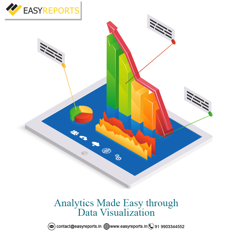
What is Data Visualization?
As the name depicts, data visualization is evaluating and analyzing data through numerous charts, graphs and images. The main advantage of data visualization is it is easily legible and interpretable. In addition, pictures and graphs are less monotonous than simple number and texts.
EasyReports – the new age business intelligence tool addresses this pain point by helping various businesses to manage their analytics with the help of data visualization through data cubes. Let us check how –
Whenever you will log in to the dashboard of EasyReports, you will find some data cubes. These data cubes are categorized for the convenience of the user and ultimately, according to various reports, these cubes are sorted so that you can find the reports of the same genre within a single data cube.
For example, all the sales-related reports are available under the cube named as ‘Sales’. Delivery Details, Agent Wise Sales & Receipt, Credit & Cash Sales, Customer Credit History, Sales Detailed Analysis, Sales Summary, Price Level Wise Sales Details to name a few are available under this ‘Sales’ cube.
With the help of these reports, you will be able to visualize data in the form of charts and graphs. That helps in making quicker decisions. Sounds Greek? Okay! Let me give you a simple example. Suppose, you are getting “Customer Bill-Wise Transaction Details” in the form of an Excel sheet, it would naturally be difficult for you to get the analytics from those raw data. On the other hand, imagine that you are getting the same data in the form of a chart with diagram – which is not only easily legible but also less monotonous and more eye-catching.
Thus, EasyReports, with its stunning data cubes is helping organizations to get maximum ROI by taking perfect decisions on time through data visualization. It also helps you in minimizing the resource engagement in report generation which means more optimum utilization of human resource with almost zero error and a better time management.